A Design System for Designers, Startups, and Product teams building with
Speed & Clarity
Designing for light and dark themes? Iamchuck UI has you set. Iamchuck UI supports native
light and dark mode across components and tokens, so switching themes never means
reworking designs. A simple toggle. Clean. Predictable. Built in.
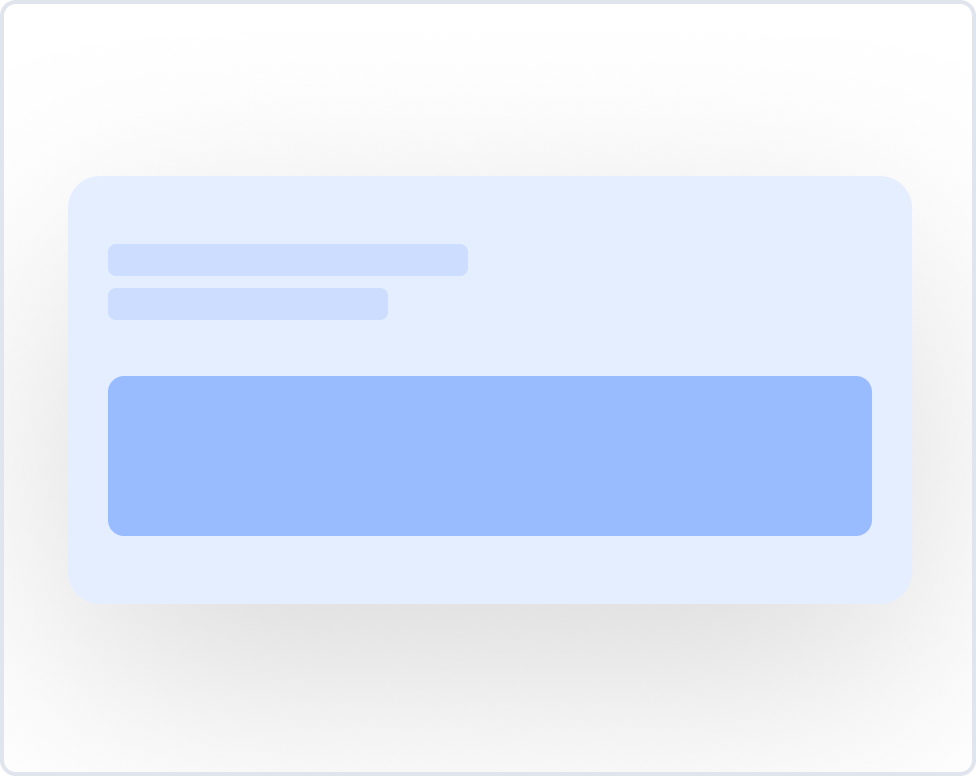
Not another UI kit. Iamchuck UI is the system layer that keeps your product consistent day to day, across teams and releases.
Built for speed, scalability, and lower costs. Designed to help teams ship faster.
Design teams, freelancers, and product builders use Iamchuck UI to cut design time, speed up handoffs, and avoid repetitive work, without starting from scratch.
reusable components, variants, and blocks built for real product workflows.
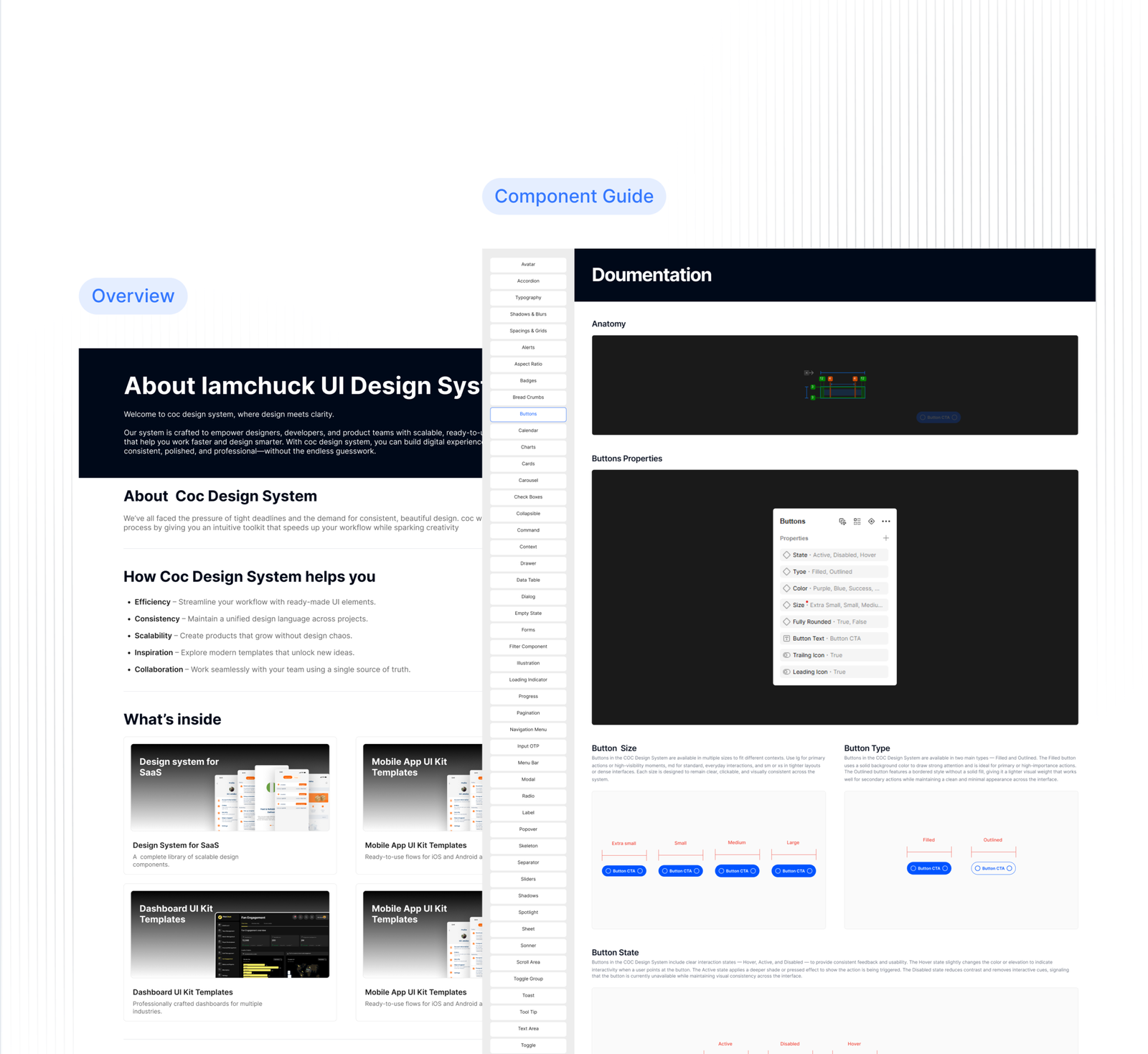
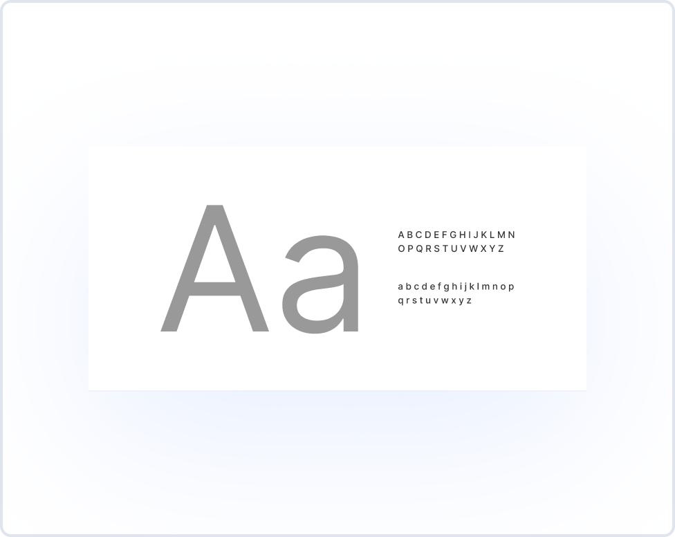
2000+ Styles & Tokens
Foundational UI styles including variables, tokens, icons, logos, flags, and illustrations
Enable Dark Mode
Native light and dark mode support across components and tokens, with no rework or overrides needed.
Websites
A complete UI system for teams building modern SaaS Websites
Websites
Build SaaS websites faster with ready to use sections.
Skip the blank canvas. Iamchuck UI comes with structured SaaS website sections designed to work together from the start. Customize layouts, swap components, and move from idea to live site without slowing down.
What you get:
10+ Fully Responsive Website Templates for Desktop & Mobile
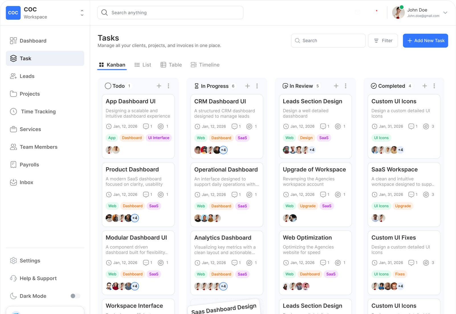
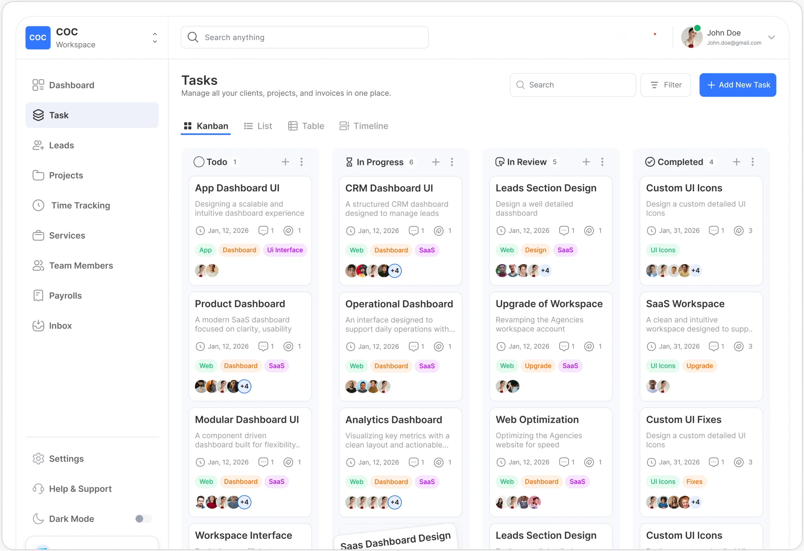
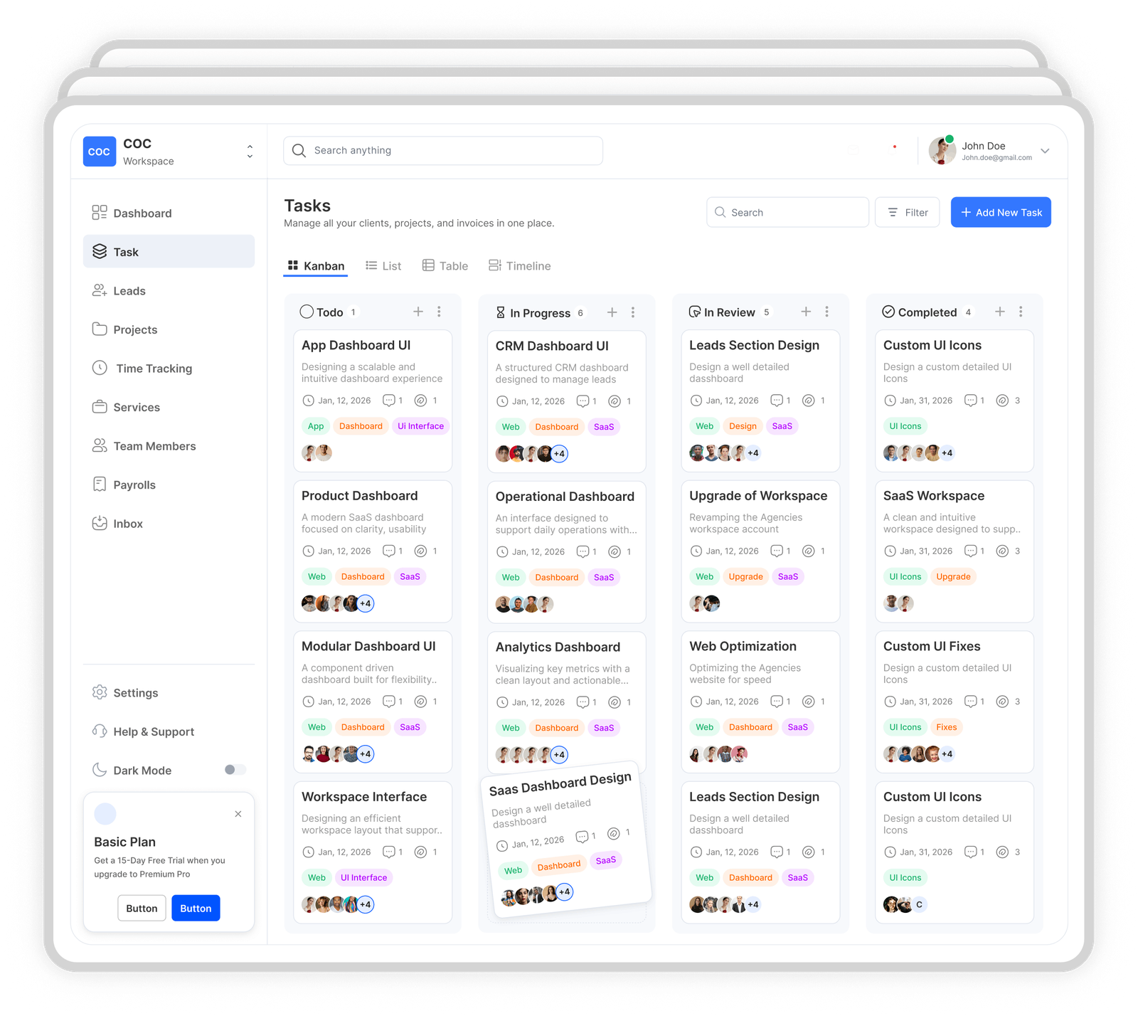
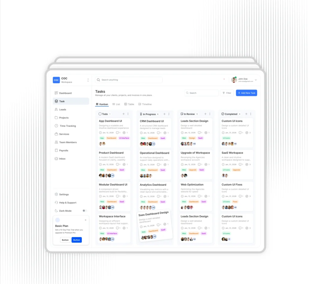
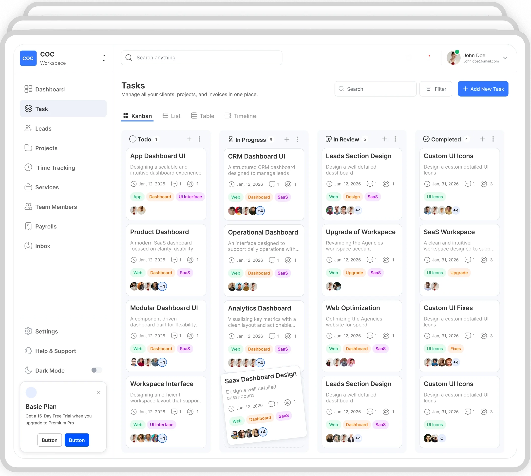
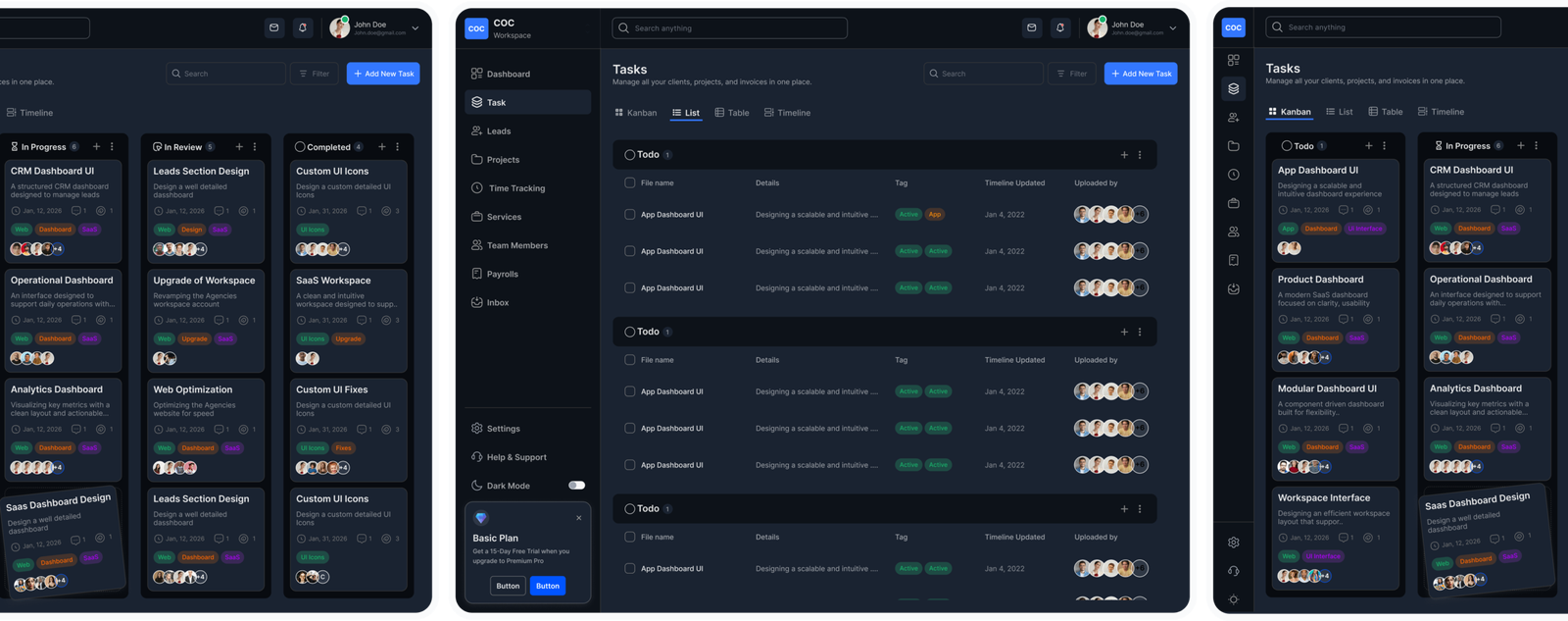
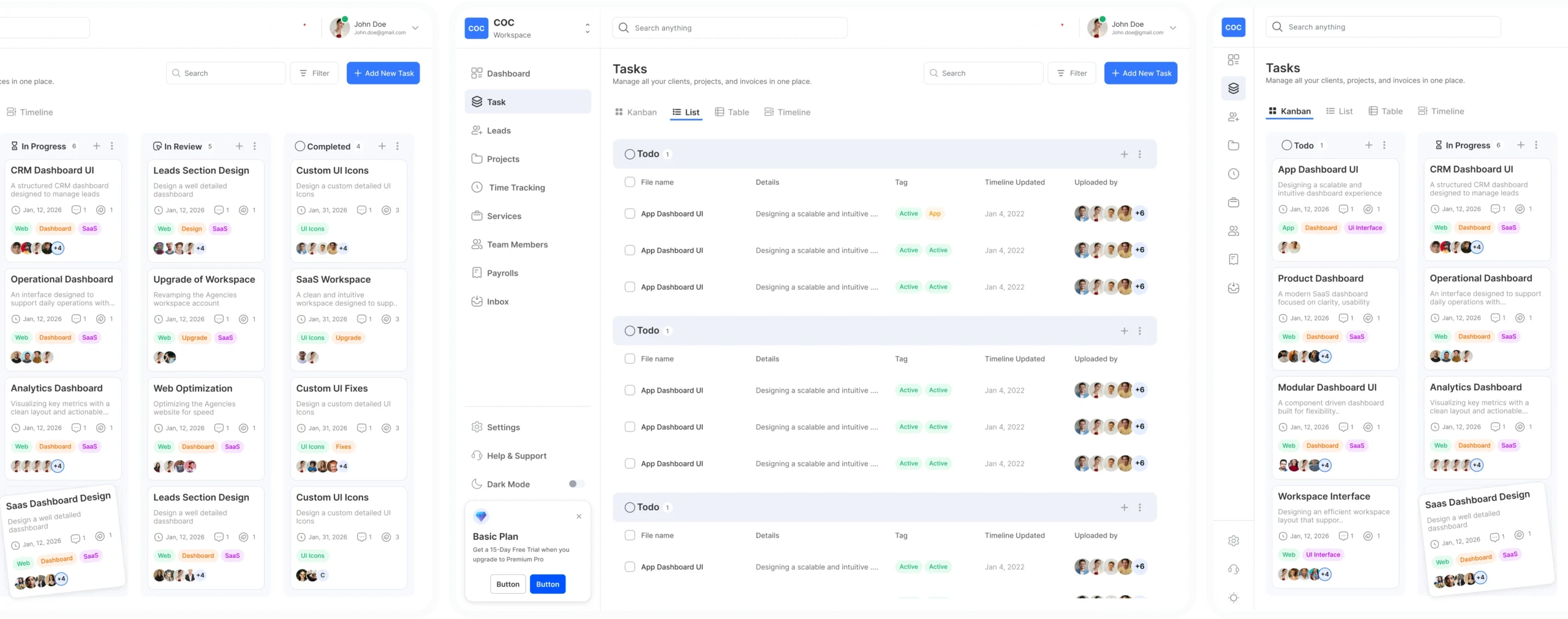
A complete UI system for teams building modern Dashboards & Web A
Dashboards
Build SaaS websites faster with ready to use sections.
Skip the blank canvas. Iamchuck UI comes with structured SaaS website sections designed to work together from the start. Customize layouts, swap components, and move from idea to live site without slowing down.
What you get:
10+ Fully Responsive Website Templates for Desktop & Mobile
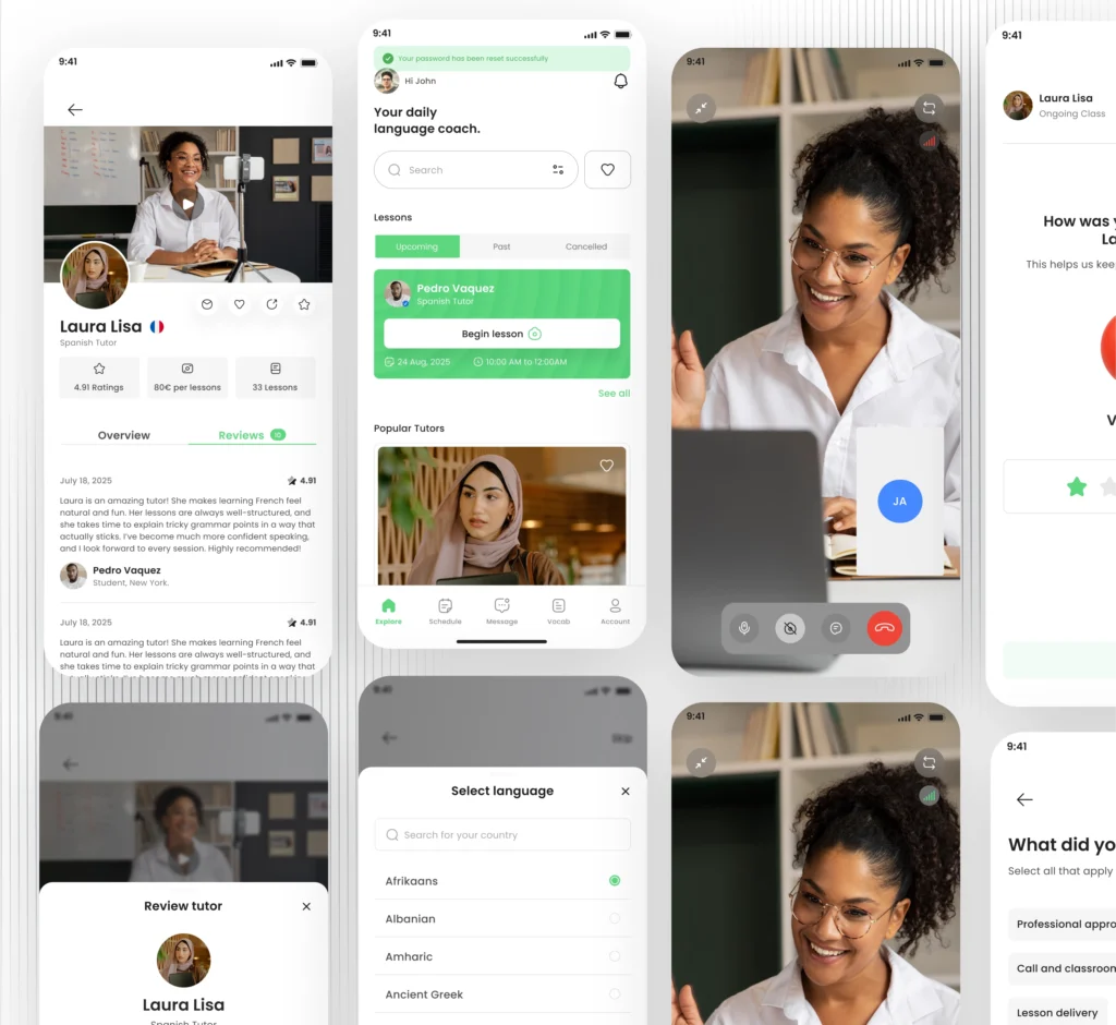
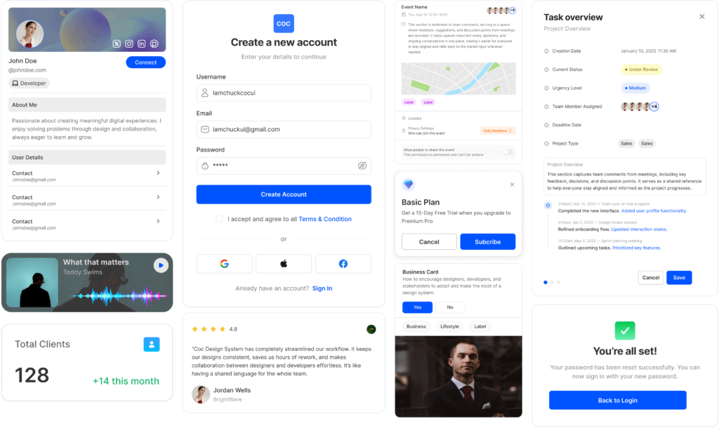
A complete UI system for teams building modern Mobile Apps
Mobile Apps
Build SaaS websites faster with ready to use sections.
Skip the blank canvas. Iamchuck UI comes with structured SaaS website sections designed to work together from the start. Customize layouts, swap components, and move from idea to live site without slowing down.
What you get:
10+ Fully Responsive Website Templates for Desktop & Mobile
Great design drives results. Get your product polished and ready for the market,quickly.
Time and again, we’ve seen that well-crafted, purposeful design does more than look good—it performs better, converts more, and earns user trust faster.
Clear directions to help you navigate, without getting lost in the details.
Packed with detailed documentation, step-by-step guides, and real-world examples, so you’re never left guessing. Everything is broken down clearly, whether you’re a junior designer or just getting started.”
Built for people who want fast results without compromising on excellence.
Iamchuck UI is built for creators who want to move fast and still maintain top-tier quality—helping you produce polished work without repeatedly rebuilding layouts, components, or design systems from scratch.
Iamchuck UI saved us weeks of setup time. Its structure is rock-solid, with thoughtfully organized components and styles that make building real products seamless. Everything feels production-ready, not just like placeholders or demo screens, allowing our team to focus on creating features and experiences instead of reinventing the basics.
Carlos Rodrigo
Snr Designer
Iamchuck UI helped us reclaim weeks of setup time. Its well-organized components and reliable structure make building real products smooth and efficient. Everything is ready for production, not just demo screens or placeholders, letting our team concentrate on crafting features and experiences instead of rebuilding the fundamentals.
Sofia Lauren
Snr Designer
Iamchuck UI drastically reduced our setup time. With a solid structure and carefully designed components and styles, creating real products feels effortless. Everything is production-ready, not just demo content, so our team can focus on building features and experiences instead of redoing the basics.
Daniel Craig
Snr Designer
Iamchuck UI saved us weeks of setup time. The structure is solid, and everything feels ready for real products, not just demos.
Jessica Barbas
Snr Designer
Iamchuck UI cut our setup time by weeks. Its robust structure and ready-to-use components make building real products effortless—no more demos or placeholders, just fully production-ready design.
Jessica Barbas
Snr Designer
Iamchuck UI saved us weeks of setup time. Its structure is rock-solid, with thoughtfully organized components and styles that make building real products seamless. Everything feels production-ready, not just like placeholders or demo screens, allowing our team to focus on creating features and experiences instead of reinventing the basics.
Akim Fatima
Snr Designer
Iamchuck UI saved us weeks of setup time. The structure is solid, and everything feels ready for real products, not just demos.
Jessica Barbas
Snr Designer
Iamchuck UI helped us reclaim weeks of setup time. Its well-organized components and reliable structure make building real products smooth and efficient. Everything is ready for production, not just demo screens or placeholders, letting our team concentrate on crafting features and experiences instead of rebuilding the fundamentals.
Pau Mitchell
Snr Designer
Iamchuck UI saved us weeks of setup time. Its structure is rock-solid, with thoughtfully organized components and styles that make building real products seamless. Everything feels production-ready, not just like placeholders or demo screens, allowing our team to focus on creating features and experiences instead of reinventing the basics.
Zainab Ahmed
Snr Designer
Iamchuck UI saved us weeks of setup time. Its structure is rock-solid, with thoughtfully organized components and styles that make building real products seamless. Everything feels production-ready, not just like placeholders or demo screens, allowing our team to focus on creating features and experiences instead of reinventing the basics.
Insert subtext here. For better readability and visual flow, split longer text into two lines. Insert subtext here. For better readability and visual flow, split longer text into two lines.
Who is Iamchuck UI made for?
Insert subtext here. For better readability and visual flow, split longer text into two lines. Insert subtext here. For better readability and visual flow, split longer text into two lines.
Is Iamchuck UI v2 open-source or commercial?
Insert subtext here. For better readability and visual flow, split longer text into two lines. Insert subtext here. For better readability and visual flow, split longer text into two lines.
Am I allowed to use Iamchuck UI in commercial projects?
Insert subtext here. For better readability and visual flow, split longer text into two lines. Insert subtext here. For better readability and visual flow, split longer text into two lines.
Is there documentation or a guide available to help me get started with Iamchuck UI?
Insert subtext here. For better readability and visual flow, split longer text into two lines. Insert subtext here. For better readability and visual flow, split longer text into two lines.
Does Iamchuck UI provide pre-made templates or UI design kits?
Insert subtext here. For better readability and visual flow, split longer text into two lines. Insert subtext here. For better readability and visual flow, split longer text into two lines.
Newsletter
Be the first to know about new dashboards, mobile screens, landing pages, and system upgrades.


