Atoms
Essential single-purpose UI elements that form the base of every interface — including avatars, buttons, input fields, progress indicators, empty states, and badges — designed to be simple, reusable, and consistent across your product.
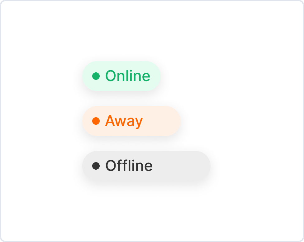
Avatar
100 variants, 6 statuses, 7 sizes
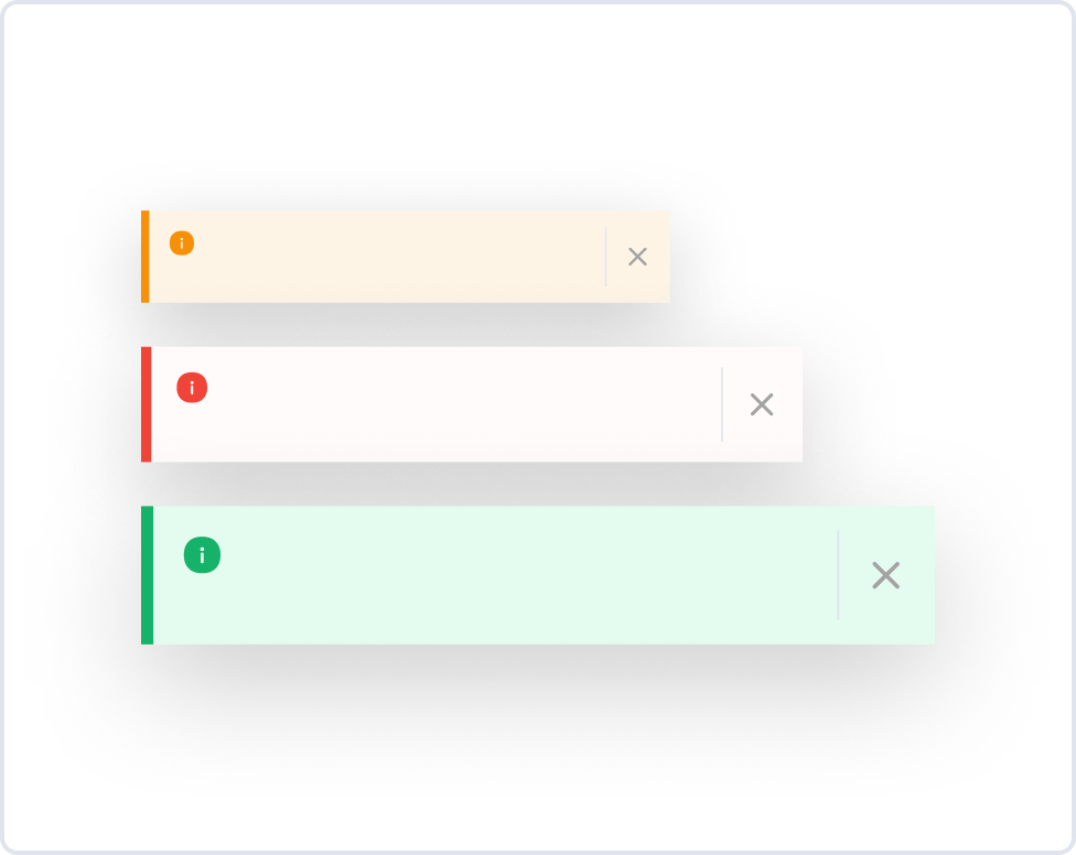
Badges
255 variants, 4 styles, 4 types
Buttons
240 variants, 4 sizes, 2 types
Empty Sates
60 types, 3 styles
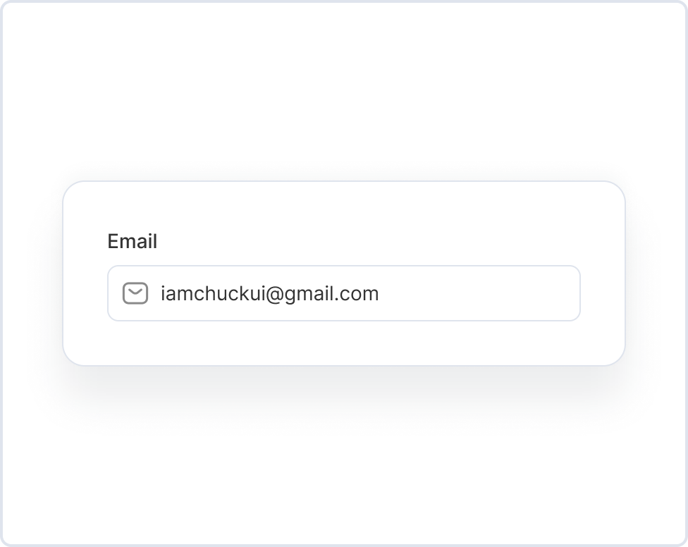
Input Fields
192 variants, 2 types, 4 sizes
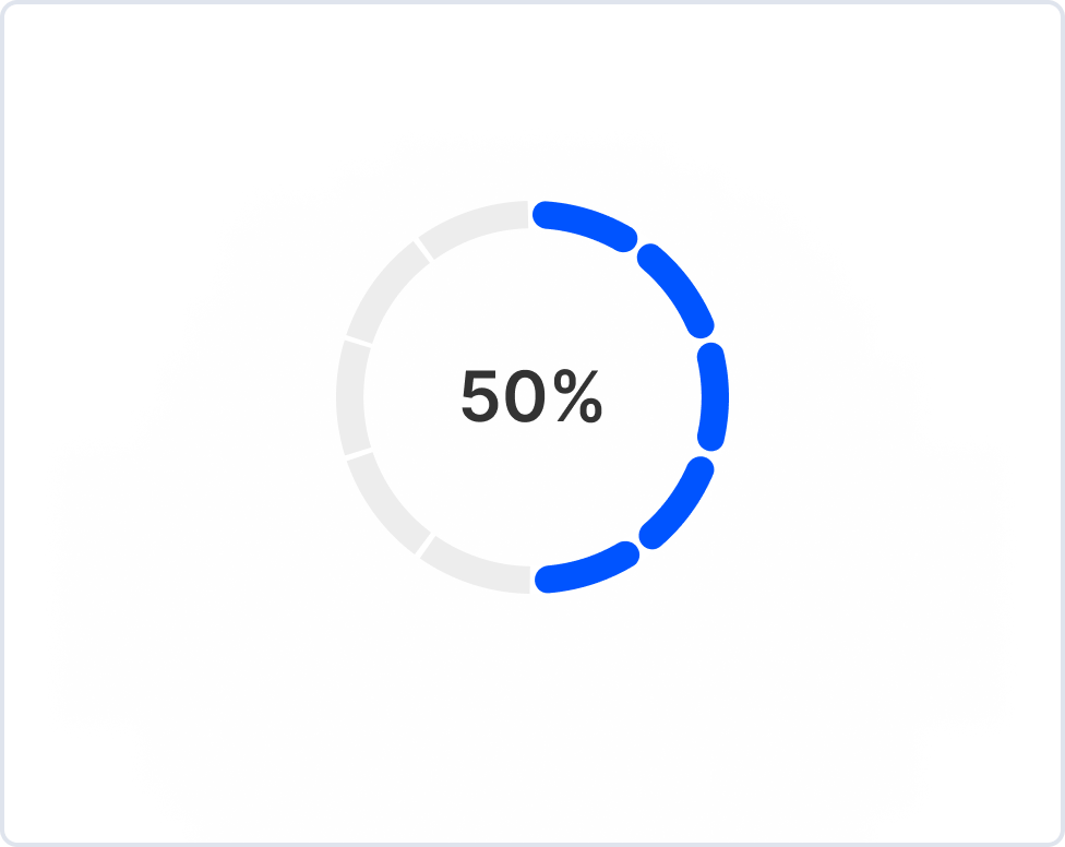
Progress
176 variants, 5 sizes, 3 types